Using the same reading order as my previous 3D models, I did 2 examples using dots (1) / lines (5) & seashell (00), like the true Mayan Numeral system.

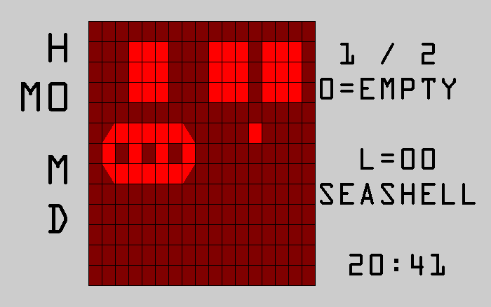
I chose the 2nd type of “seashell” & did a few extra examples:

Using the same reading order as my previous 3D models, I did 2 examples using dots (1) / lines (5) & seashell (00), like the true Mayan Numeral system.
I chose the 2nd type of “seashell” & did a few extra examples:
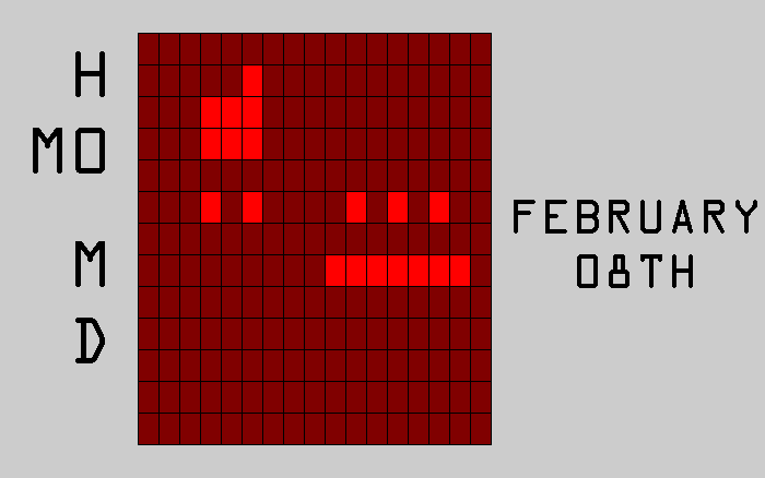
In the past 2 months, I’ve re-worked this old concept:
I removed the seconds to get a square display:

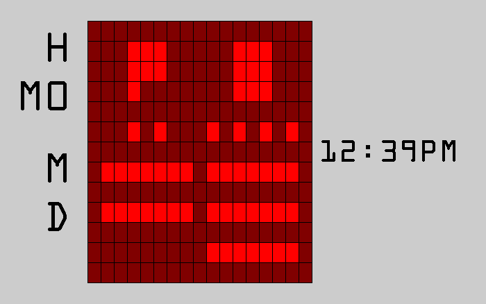
This version would be e-paper & give these advantages:
– black text or white text
– reading as columns (shown) or rows (not shown)
– rows would be hour on top & minutes under (swap the top right box with the bottom left box)
I had the row reading & e-paper ideas after working on this 2nd version:

Then, I’ve worked on sketches for a clock version. It gave me a new idea for a watch. This watch combines 5 displays/reading methods:


The time can be switched between the 12 & 24 hours formats!
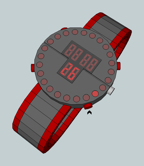
Then, I’ve worked on the rest of the watch:
– the band face would be like the “satellite X” watch by Tokyoflash (it’s inspiration). However, I would prefer to use metal embossed band/strap (see this Nekura)
– the grid effect would continue as lines drawn over/under the lens.
– the sides of the lens would be curved, like 1/4 of a cylinder.
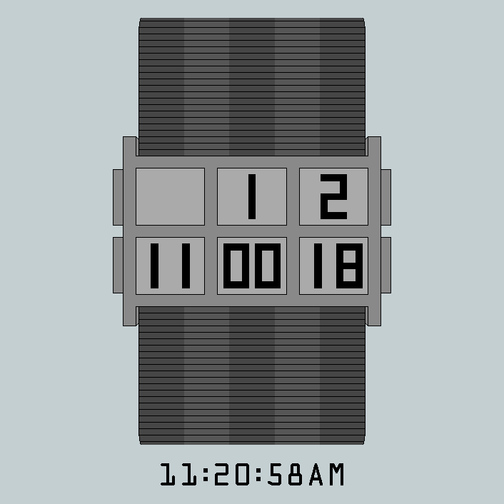
The reading follow the Mayan Numeral system:
If present, a single digit is multiplied by 20.
Then the dual-digits value is added.
If the time is 19 or under, there’s no 0 as a single digit & the “+” sign doesn’t appear. However, 00 appear & anything between 1-9 are 01-09. Also, the “+” sign doesn’t appear after the A (AM), P (PM) or d (date).
I did 4 examples using the 1st reading option, which is my favorite.


I did 2 pictures with a more realistic lens:


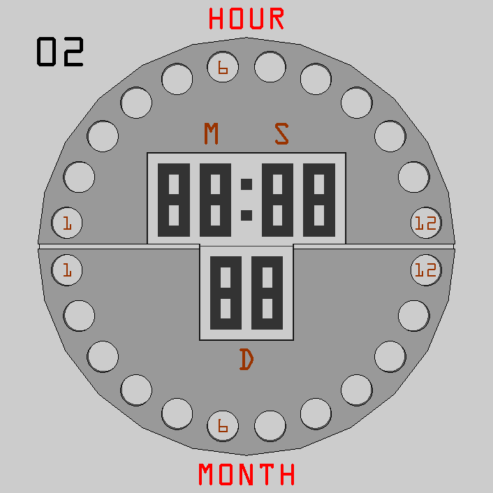
The ideas behind this concept were:
– Using 12 dots for the Hour and 12 dots for the Months.
– Arranging them in a circle close to the edge of the case.
– The rest would use digits, placed close to the center.
I’ve used the top 50% dots for the Hour & bottom dots for the Month.
I chose to arrange the 6 digits in a “T” formation in the center:
M-S on top of the center line and the Date under.
Then, I thought that it would be nice to have the possibility to either show only the time, only the date or to show both at the same time.
This is why I did it in LED and added an extra button at 3 o’clock.
Pressing it show both the time and date.
Pressing the button over it show the time and pressing the button under it show the date.
I’ve place 2 buttons on the left. They are used to setup the time/date.


While drafting the basics ideas, I realized that there was 11 good displays. I chose to do a 3D model of my preferred and, after, I chose to share the others 10, which are under.


A while ago, I did a concept nicknamed “vertical scale”. The display was considered good, but not the ’70 cases examples.
1st, a diagram explaining how to tell the time:
The “pm/alarm/date” always appear at the top. The 4 single minute are divided in 2 blocks on 1 line. That line always float over the 5 minutes segments that are on.
I’ve re-worked the case & band. I have 3 basic concepts with a few variations in each:
style 1:
The sides of the case have engraved lines.
Their amounts vary.
The band, or straps, are also engraved.
2 colors, or 1, can be used.


The buttons are hidden under the sides or fully integrated.
Style 2:
1/2 cylinders around the display.
The band can have 3 vertical 1/2 cylinders.
They can be connected at the top of the 1st link, on each side.

Style 3:
Multiple segments per links.


https://www.facebook.com/MinakiDesign
https://twitter.com/MinakiDesign
I use & update my Facebook often. I verify Twitter a few time a day, but rarely post anything.
I have Coroflot & LinkedIn accounts, that I have to find.

